Under the striking sun and occasional soft rain, Milan Design Week welcomed thousands of international visitors to its floors for the city’s annual celebration of furniture, lighting and decor. Composed of Salon De Mobile, an illustrious trade show stationed outside the city centre and Furorisalone, a set-up of breathtaking exhibitions across Central Milan, the event strung together eye-catching exhibits and glorious product launches.
From majestic downtown palaces to forgotten military barracks, the world’s design capital was set to strive for creativity. With more than 2000 exhibitors presenting the most spellbinding and thought-provoking pieces of art and design and over 1500 events taking place, attendees were left awestruck with what was on display.
The bright- futuristic installations brought in by world-renowned and Avant-garde designers and artists – returned to the pre-pandemic size after the event got cancelled in 2020 and was also forced to tone down in 2021.
Do you know how I’d best describe this phenomenal site? Exactly what dreams are made of! The only difference is that the fair talks of the future, a way to create awareness and promote the thought of creativity and longevity through home decor and furniture.
Table of contents
Salon Del Mobile – Furniture Fair
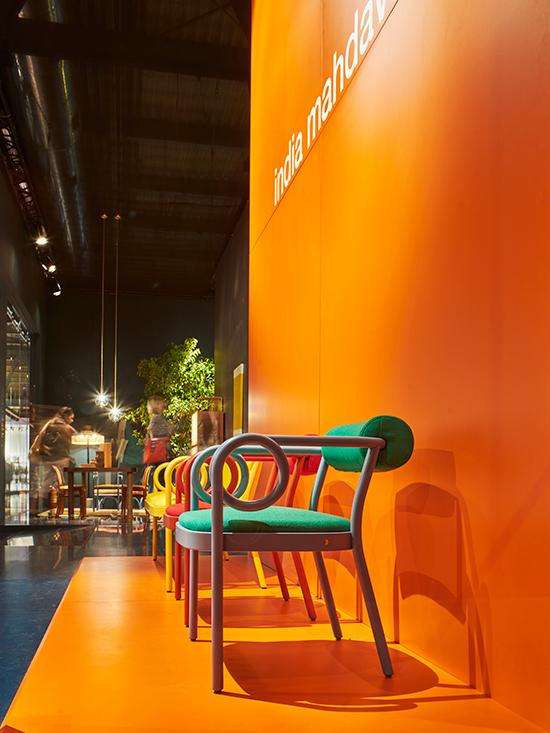
The 60th edition of the Salon Del Mobile, which takes place each year at the Milan Design Week, welcomed` visitors from 7th June to 12th June, heralding a milestone in creativity and innovation. The rich culture of this event populated the palazzos, courtyard, galleries and industrial spaces. Brimming with creativity, new launches and grand installations, all this helped the people discover the city’s design highlights.
The Salon had partnered with award-winning Illustrator Emiliano Ponzi to design a series of posters for the occasion. These will be equipped with Augmented Reality imagery, which can be accessed through QR codes, each of which takes you on a ride back in the history of the exhibition and the design culture of Milan. Designers who participated in the event also discussed their concept inspiration and the deep relationship that connects furniture, future and functionality.
source – salonemilano
The big focus at the Salon this year was creating an intersection between design and sustainability. The organisers led the way by encouraging the mass to utilise re-usable materials that leave a low- environmental impact and help the Forest Stewardship Council (FSC) and Programme for the Endorsement of Forest Certification (PEFC) with communal spaces. On the whole, this project was a representation of a possible future, i.e.a virtuous ecosystem.
Interni – Design Re-Generation
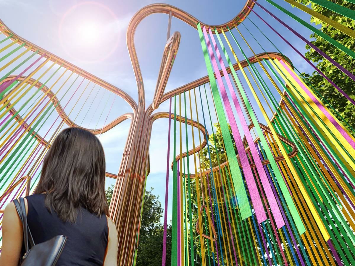
A place of meditation and cultivation situated in the heart of Milan – Brera Botanical Garden was the location for one of the most unique installations, “Feeling the Energy”. It was created by CRA- Carlo Ratti Associati and Italo Rota in the exhibition of Interni-Design Re-generation.
source – fuorisalone
The exhibit uses 500 meters of anti-bacterial copper tubes to bring to life an installation for people to understand multiple forms of sustainable energy production and cosplay with sound, evaporative cooling and light. The core thought behind the creation of the Interni- Design Re-Generation concept– is “Regeneration is a chemical process, produced by man. Rebirth is a natural process, which can also belong to the metaphysical sphere”, quote Andrea Branzi. Created to perfection with a hint of hue, an ensemble of material and functionality, in which sustainability is the core value for a new quality of life.
Have you felt the energy yet?
Design Re-Generation, the show’s central theme, invites you to think about the role of design in creating sustainable solutions for the future. Explore the verdant labyrinth designed by Raffaello Galliotto for furniture brand Nardi, interact with the voice-responsive Hydra-fountain by Elena Salmistraro and stay fit at the Techno pavilion by Zaha Hadid Architects.
see also – Zaha Hadid’s Architecture: Edifice of the Future
Alcova
While walking through the abandoned interiors of a military war compound, Valentina Ciuffi and Joseph Grima created a master collection where you’ll find a unique platform that explores developments in the field of design, including material, social practices and the sustainable nature of the building.
Alcova’s 4th edition, this exhibit incorporated an experimental design set in the former war hospital of Centro Ospedaliero Militare Di Milano. Alcova showcases a comprehensive and inspiring selection of international designers and emerging talents. The main focus was kept on the technology, materials and eco-friendly production process. Amidst the exemplifying spirits and the toll that wars have left, stands this massive and thick textile sculpture in an airy hospital room, “Spoken Lines,” a collaboration between Beni Rugs and Colin King.
Stained glass windows with an industrial design by Kickie Chudikova, i.e. reminiscent of the old times. This one’s an independent design developed by Space Caviar and Studio Verdit. The urban jungle setting seems unusual for an exhibition that addresses mental health, cultural identity and climate change. Included as an installation by Spanish Designer Jorge Penades, he found inspiration from Kinesiology tape that was used to apply on human injuries. He used brightly coloured tape and wood to create furniture like a ping pong table.
Who says you can’t create profound pieces of art with waste products?
(P.s.:It could be said with confidence that Forrest Gump would give his approval to this ping pong table, although he might need half of that.)
Hermès
Inside La Pelota Jai Alia, an indoor sports centre in the heart of Brera, Milan, was home to vivid installations that introduced visitors to the French fashion house’s latest display, an inconsistency between tradition and invention. Each year they create a new home collection for the Milan Design Week, Too boujee? Yes, Hermès has always been a stunner, no questions asked!
source – assets.hermes.com
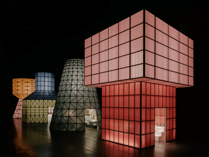
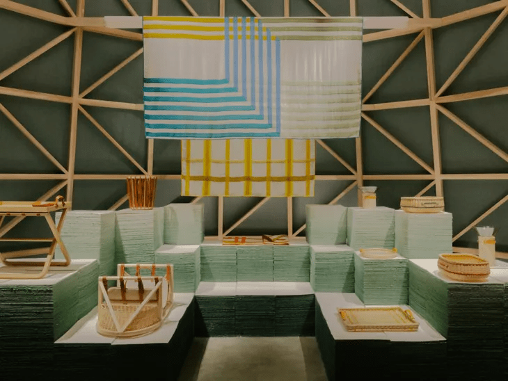
A challenge to gravity and light, these decor pieces rested inside four large, brightly coloured structures–that resemble water towers. Created out of wood and covered with translucent coloured paper, the structures radiated light that could attract anyone, just like a mirage in the middle of the desert.
The four massive translucent arrangements play with the theme of light and gravity while maintaining the balance between light and colour. If you let your imagination run wild, the installation reminds you of the 1977 cult classic, Susperia.
“Perception changes as light play over them when they are backlit, each a poetic colossus and a point of anchor for these little miracles of balance” -Hermès
source – assets.hermes.com
For the first time, textiles became the central theme of a collection and featured six creations along with the most famous cashmere Hermès’ favourite choice of material.
Visitors could walk into these structures, which are made of ash wood and paper, to find the brand’s latest homeware collection displayed on paper pulp and hanging on wooden rails. Hermès artistic directors Charlotte Macaux Perelman and Alexis Fabry built the structure to reflect the brand’s 2022 theme of lightness.
Perelman was inspired to make the structures after reading a photography book called Water Towers by Bernd Becher and Hilla Becher. These industrial structures come in a variety of shapes and materials such as metal, concrete and wood and can be set on stones and even towering pylons. After the design week, the installation will be reused and recycled, with the paper pulp on display will be sent back to a factory to create paper.
Light-Based on Sound
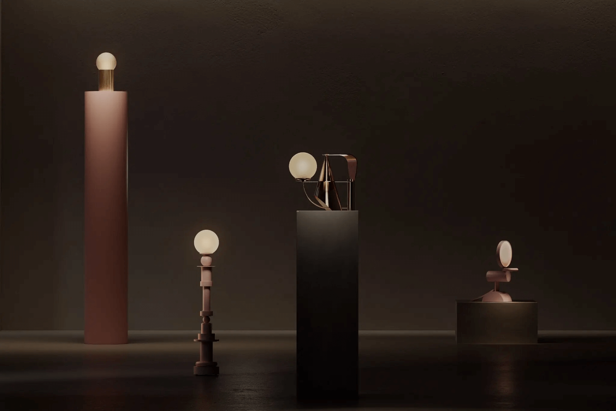
Anybody out there who loves listening to Jazz will really soak in this next exhibition. Barcelona-based artist, Andres Reisinger created a set of dreamlike light fixtures that were inspired by 1960s Free Jazz. The four pieces, which Mr Reisinger refers to as “Illuminated sculptures”, were exhibited at Nilufar Design Gallery at the office of the founder, Nina Yashar.
Created out of metal and wood, and wrapped by a glowing glass orb, the designs represent Jazz’s free-flowing and improvisational nature with their different heights and shapes. Each piece represents a different song and mood.
source – nytimes
Andres initially envisioned the pieces in a room akin to a musician’s rehearsal space, low-lit and smokey, hereby surrounding the office with metal sheets adding a hazy effect. Regardless, this exhibit could take you back to a 60s Jazz bar during an Ella Fitzgerald gig. Now that my friend is one solid power these installations hold!
see also – Biophilic Designs: Incorporating Nature Indoors and Outdoors
Divided Layers
source – hypebeast
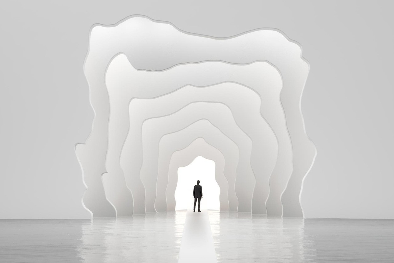
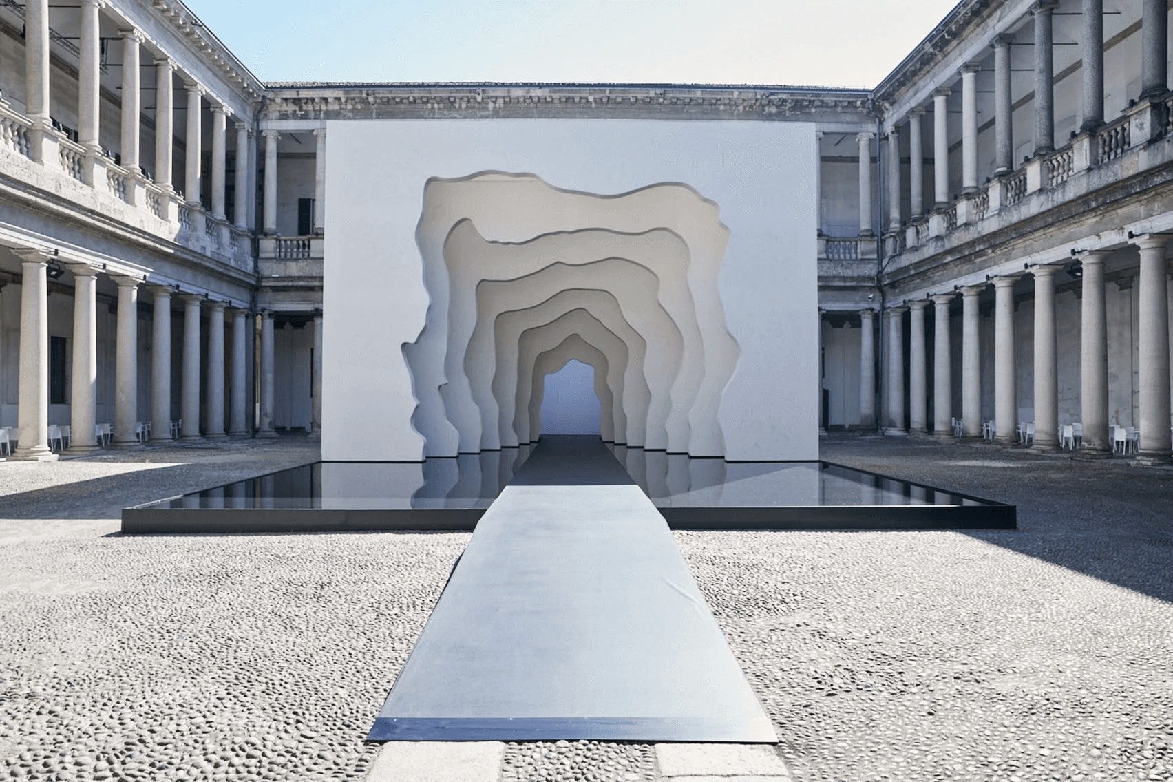
Kohler, an international lifestyle brand and Senpai of kitchen and bath products returned to Milan Design Week 2022 with a bang! The immersive art pieces were in partnership with artist-designer, Daniel Arsham. This installation was designed to create a walkable interpretation of a “sink”. Called Divided Layers, the exhibit was made from seven stacked white panels that were arranged to form a tunnel, accessed by a platform accompanying a massive water feature.
The large pool of water surrounding the panels reflects striking shadows on their white exterior. After dark, the panels were illuminated by backlighting.
source – dezeen
Isn’t it mesmerising? Also, this installation won the Fuorisalone Prize 2022 award, something that was a novel concept introduced this year and is given depending upon the vote of the audience. This prize signifies the most memorable design existent at the event.
Kohler’s Fuorisalone exhibition features a large-scale immersive art experience, a site-specific installation that builds upon the release of Rock 0.1– a 3D printed sink Daniel Arsham designed in collaboration with Kohler in 2021.
While their previous collaboration was made out of vitreous China and trademarked hand-cast brass, this installation’s panels are created from wood and finished with hand-laid cray, backed by a slightly rougher finish. Arsham states that the design was sketched by him around 10 years ago.
A scale model was placed behind the installation, which provided information about the process and materials used to create it. The tunnel-like outlook along with a plain white background provides the feeling of walking into the hull of a spaceship, almost Star Trek-like. Beam me up, Scotty!
Wrapping up
The intense designer Apocolypse that hit this pizza town has taken up the talk in Milan. This year was tailoring towards the concepts of sustainability, feminism, and body positivity, to name a few, which is something people want to listen to and talk about. This edition was not merely about taking a positive step towards the environment but also understanding the society we have transitioned into and re-creating the social norms as we walk towards the future.
Welding in the fact that from June 7-12, the streets of Milan were not only filled with the fragrance of pizzas’ and spaghetti but with designers, architects, craftsmen, experts and commoners. However, there were private parties and exclusive meets, and public gatherings in one place, which reminded an essential precept of Milan Design Week 2022. The city opened doors to all who were eager to explore its wealth of design heritage.


