There’s a hundred and four days of summer vacation
‘Til school comes along & to end it
So, the annual problem for our generation?
Is to save ourselves from the heatwaves…
Like maybe…
Japanese award-winning pavilion Kumiko facade!
(My Rendition of Phineas & Ferbs Title song)
When these lyrics were penned in the ’80s and ’90s, scientists and world leaders recognised the emergence of global warming. Since then, it has become a reason for many inventors to create a greener tomorrow. We will not go through each of them, but the one we promised in the heading! So, to know how this simple structure has taken everyone’s breath away, we need to understand where it came from and why it was planned in the first place.
In 2020, Dubai successfully secured the opportunity to host the first Expo in the Middle East. However, the subsequent edition was postponed, as were many other planned events, due to the pandemic. Despite the delay, the event retained its original name, “Dubai Expo 2020,” and took place from October 1, 2021, to March 31, 2022.
Next, the theme! The Expo theme was “Connecting Minds, Creating Future” to promote Global sustainability, mobility and opportunity. Parallel to the Expo, Japan is also planning to promote its exhibition of Osaka 2025 through the pavilion “Join.Sync.Act.” The theme of their future expo is aligned with their presentation in Dubai.
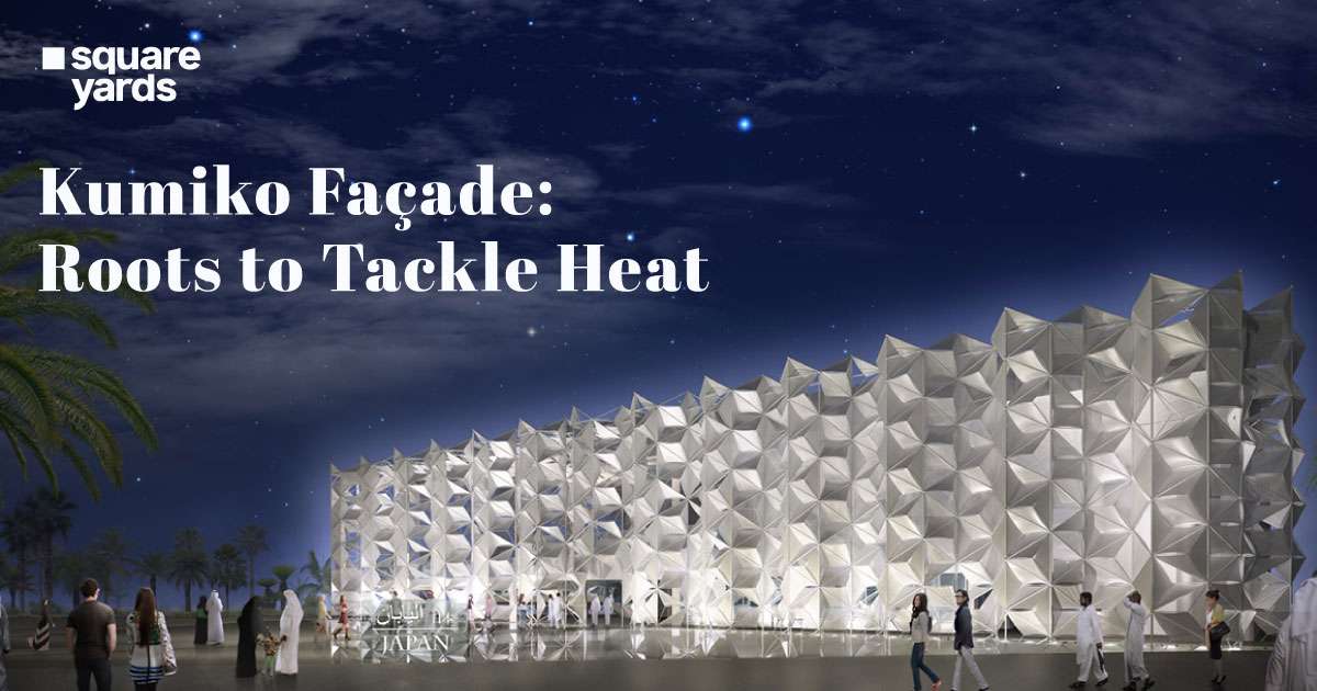
To kill two birds with one stone, Japan built a facade that won a golden award in the exhibition design category for the large pavilion in Dubai. It created awareness towards their idea of “Where Ideas Meet”. How? Let’s dig and brush up on the cultural roots of this facade.
How Was This Conceived?
Source: World Architecture
“Connecting the Minds of Arabic and Japanese Past to Meet with the Ideas of a Creative Future”
To tackle the fierce competition, Japan took a unique approach. They entrusted Yuko Nagayama and Associates (Arup Tokyo and Dubai) to work their magic.
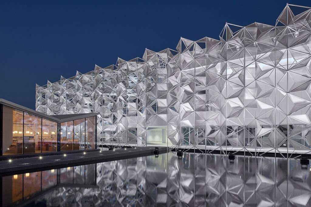
They studied the past architecture and techniques people used to make infrastructure. From Arabic culture, they have carefully studied Arabesque and Asanoha patterns. Old tombs succeeded in keeping the tomb’s temperature moderate in all seasons. On the other hand, the Japanese were looking at Origata and “Asa no Ha” or hemp leaf patterns (same as Asanoha patterns) for lightweight and sustainable construction. Water played a dual role, embodying both cultural significance and a symbol of serenity and coolness. The intricate fusion of these cultures birthed the concept of the “Kumiko Facade.”
Award Winning Exhibit
Source: Metalocus
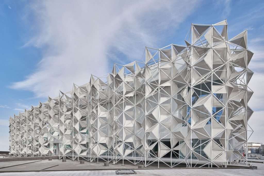
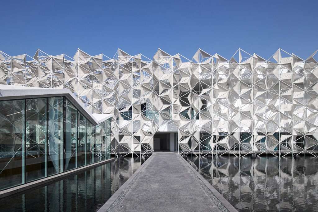
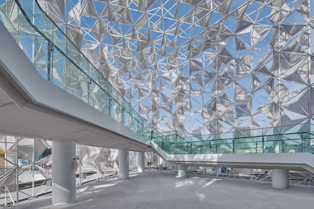
Now that you know how the idea originated, let’s see how it grew into this eye-catching piece. With the help of the concepts, the designers woven (or Kumiko) a tridimensional all-white exoskeleton. Each frame is made like the gates you have seen in animated cartoons like “Shin Chan” and “Doraemon”. This made the structure lightweight and translucent enough to brighten the insides during the day. However, the material is different, and the sheets are made of fluoropolymer membranes. The interesting part about these sheets is they turn from beige to white under UV light or the “SUN”. Also, the triangular shape of the structure is designed to give its efficiency a grand push.
But, can this lightweight material and sturdy exoskeleton withstand challenging weather? Heat is not the only problem that humanity faces. Rain storms are also an issue in many countries. To address that, they have incorporated membrane sheets with springy roads. This will give flexibility and strength to the sheet to stand out, even on the darkest days! This nearly transparent project has hidden depths. Some plates appear darker because they’ve layered two membranes for added strength as the structure ascends.
The team raised one more concern regarding implementing VR and 3D CDA tools (again, taking care of the world!)! One cannot demolish every other building just to make them right. So, they have made this structure independent from the whole building, making it flexible and sustainable in the new world.
Where is the Water?
Source: World Architecture
We have mentioned earlier that the pavilion also includes the element of water. If you look at the images, you can see shallow water bodies surrounding the structure. They are not for show or just to densify the cultural bond. The water bodies are crucial for the “beat the heat” analogy. While the exhibit can make the interiors cool, the exteriors, on the other hand, especially the entrance, will remain the same.
Source: Metalocus
Addressing these concerns, designers have incorporated water outside the building and large fans inside. It was the easiest way to keep the cool composure of the building intact. The water will evaporate and keep the entrance and walkways cool. Also, winds entering the building will be nothing but evaporated water, which will cool down through shadows and fan breeze.
The After Party
Since it’s a gallery, we’ll cut it down to specifics so you can enjoy a glimpse of great architecture.
South Korean Pavilion
Source: Design Diffusion
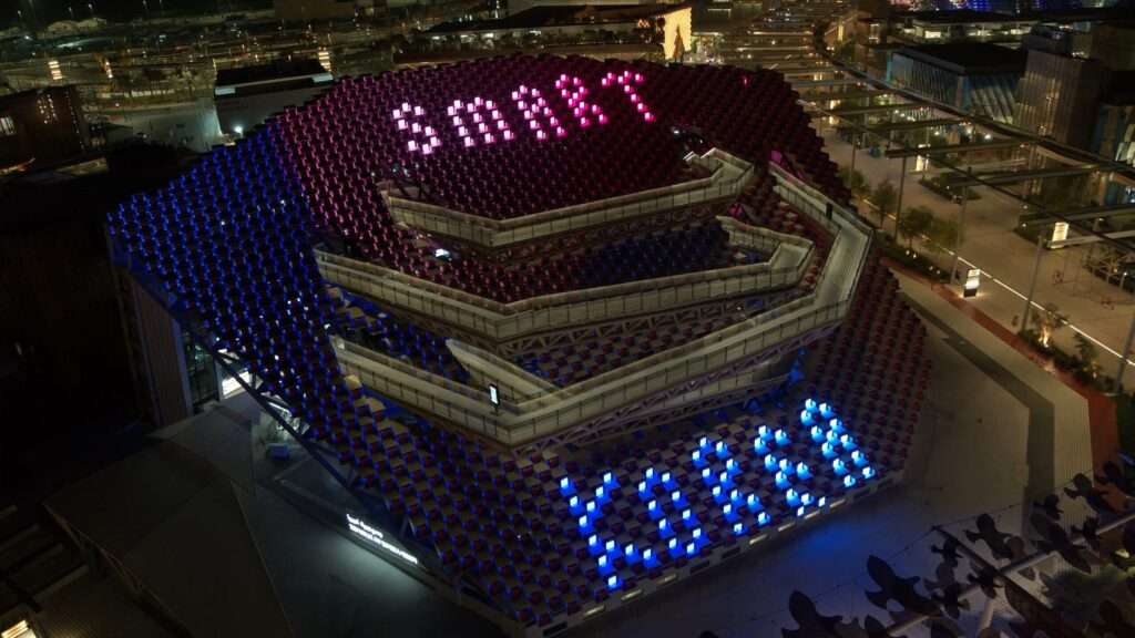
Designed by Mooyuki Architects, the pavilion showcases South Korea’s vision for the future with the “Smart Korea, Moving the World to You” theme. It combines artistic refinement and engineering perfection, featuring dramatic ramps and rotating cubes on the facade.
UAE Pavilion
Source: Design Diffusion
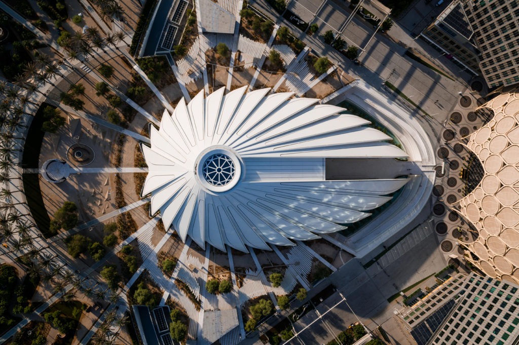
The pavilion was designed by Santiago Calatrava, inspired by the falcon, a symbol of the Emirates. It occupies an area of 15,000 square metres and is designed with sustainability. The sloping roof surfaces and large floating wings of the building create visual connections between the interior and exterior.
The Swiss Pavilion
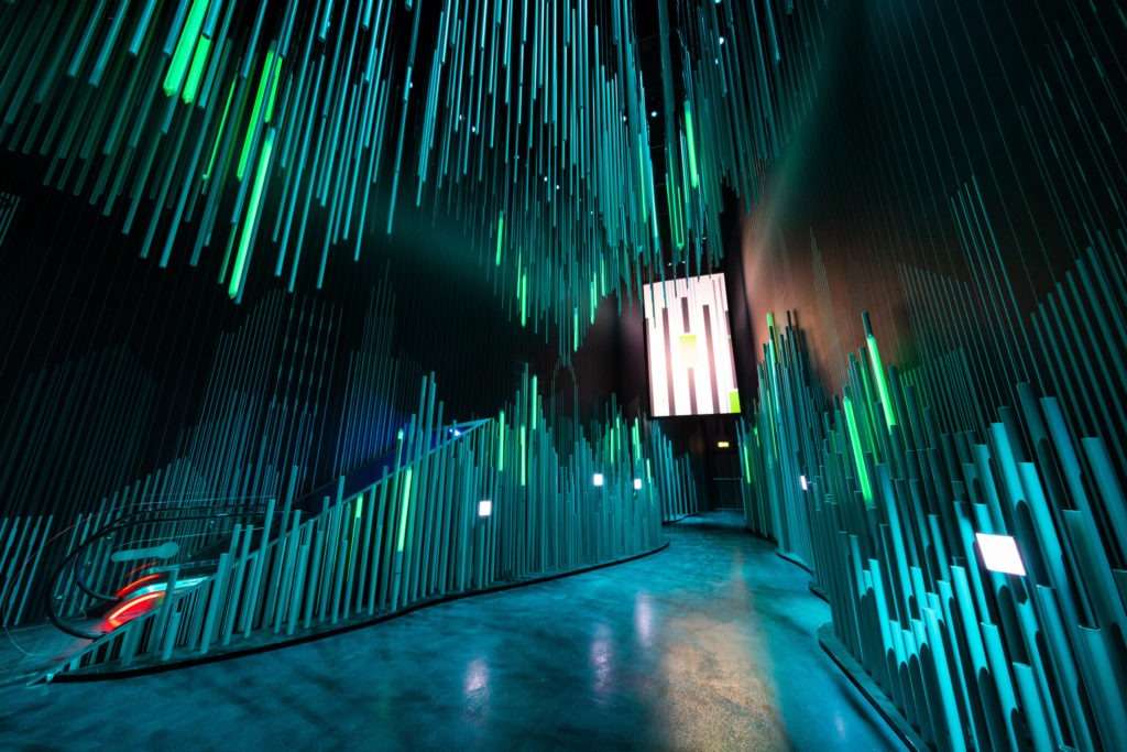
Source: Design Diffusion
Designed by Swiss studio OOS AG, it embodies the theme of “Reflections”. Inspired by Bedouin tents, the pavilion seamlessly blends tradition and innovation. Its mirrored facade creates an interactive entrance. Inside, the journey unfolds in three acts: first, a reflection-themed entrance, followed by a nature-inspired ascent through dense fog to an alpine panorama, and finally, an exploration of Switzerland as an urban and innovative hub. The pavilion showcases Switzerland’s culture, commitment to sustainability, and technological prowess.
The Finnish Pavilion
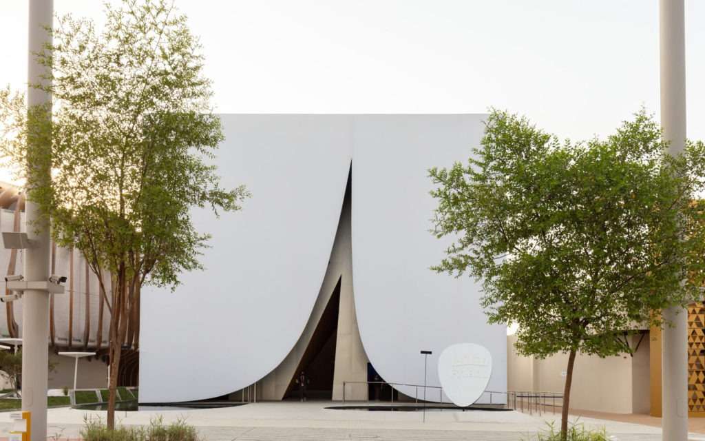
Source: Design Diffusion
Named “Lumi” after the Finnish word for snow, it was designed by JKMM Architects. Inspired by the first snow that blankets Finland’s landscape, the pavilion aims to bring a touch of Finnish nature to Dubai. It features a symbiotic exhibit that showcases the harmony between people, nature, and technology, emphasising sustainability, design innovation, and the circular economy. The pavilion’s design minimises environmental impact by using locally sourced materials.
The UK Pavilion
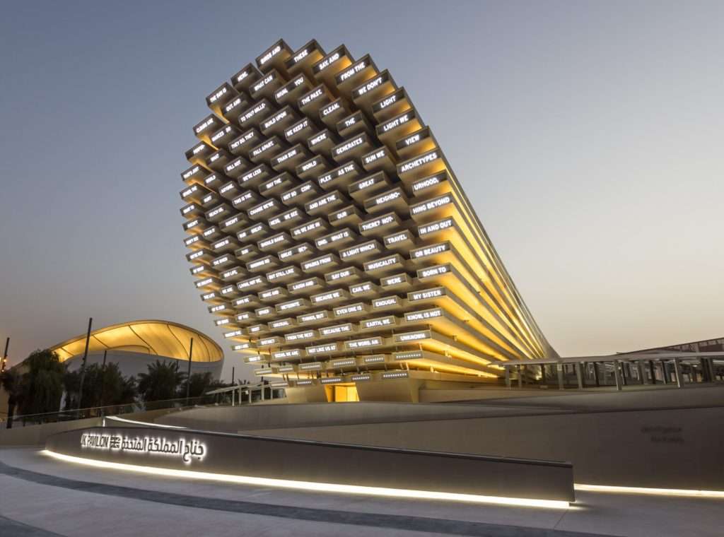
Source: Design Diffusion
Es Devlin, a British artist and designer, is the brainchild behind this eye-popping masterpiece. After the Great Exhibition of 1851, Es became the first British artist to display her work of art. The pavilion resembles a colossal 25-metre-high musical instrument constructed with eco-friendly cross-laminated timber (CLT). Upon entering, visitors are invited to contribute words in both English and Arabic to form a dynamic “Collective Message” driven by advanced machine learning algorithms. Rather than traditional exhibits, the interior boasts a curved void adorned with LED-covered walls displaying the collective poem.
The Italian Pavilion
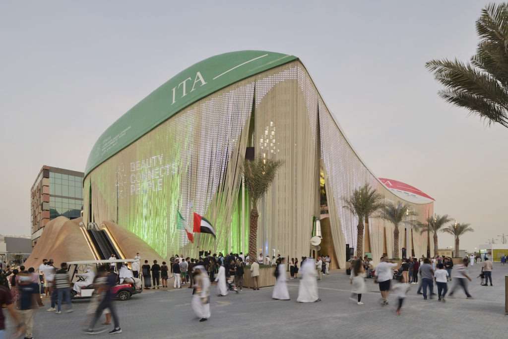
Source: Design Diffusion
Designed by CRA-Carlo Ratti Associati and Italo Rota Building Office. It features a roof made from real boat hulls, a multimedia façade with recycled plastic ropes, and natural cooling systems. The pavilion evolves, emphasising circular economy principles and showcasing innovative materials. Visitors can explore installations like the carbon dioxide fixation display and the circular Belvedere with Mediterranean plants, highlighting Italy’s role in addressing the climate crisis.
The Canadian Pavilion
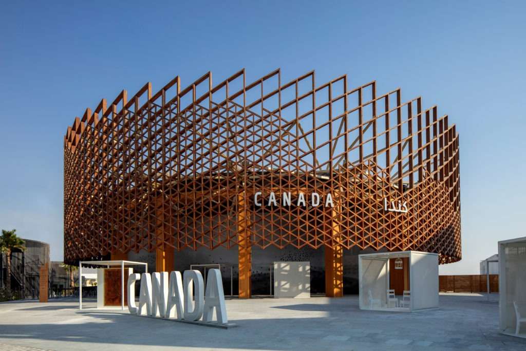
Source: Design Diffusion
Maple Country’s exhibit features a poetic installation called “Traces” by KANVA. It symbolises an uncertain future due to climate change and human development’s impact on the planet. The structure includes cubes containing preserved life forms, multimedia interactions, and a mural of birds in a fossilised landscape. It aims to raise awareness about the urgent need for environmental action.
As the Lights Dim
Today, the world is walking barefoot towards a brighter new. A life where we can tackle issues like heat and global warming with smart solutions like the Komiko facade. Everything about the Komiko building front is award-winning, from the material to practical functioning. Not just this one, but through such expeditions, inventors worldwide showcase their talents, giving us the next page of what the future beholds.


